Car logos: interesting facts and meanings

AvtoAd
27/10/2023
It is not always possible to guess at first glance what brand of car is driving past you. The color scheme and shapes of cars are mostly a tribute to fashion and have similarities among themselves in almost every manufacturer. Now imagine if there were no branded logos on the cars. Then it would be almost impossible to recognize the make of the car. However, a logo is not only a graphic element that expresses a company's identity and symbolically distinguishes it from others. This is an important part of the communication between the car manufacturer and its user, as well as the history of the brand itself. Some automotive trademarks are incredibly simple - in the form of a letter or pattern, while others are more complex and contain a hidden meaning.
Here are the first top 10 logos of the most common car brands and their meanings:
Mercedes-Benz
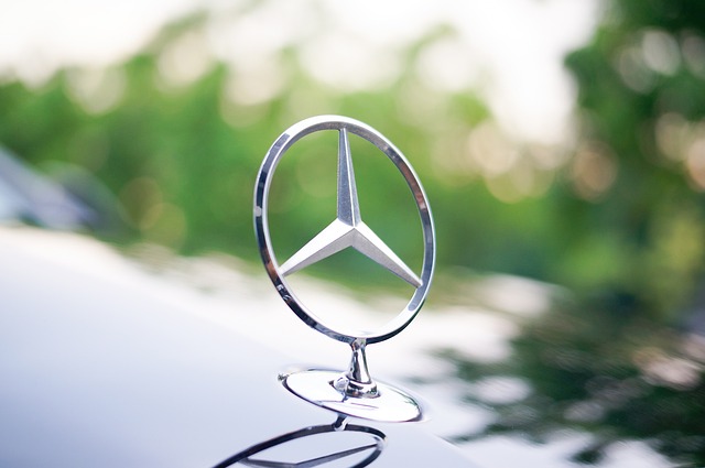
In 1909, the logo of the then company Daimler Motoren Gesselschaft (later Diamler-Benz) became the famous pointed star, which symbolized the three elements: earth, water and air. And all because at that time the concern was engaged in the production of not only passenger cars, but also engines for seagoing vessels and aviation. There is also a version about a dispute between the co-owners of the company, during which all three representatives pointed their canes forward at the same time. In the end, this ended the quarrel. And the co-owners decided that the three canes, united in a circle, would become the logo of the Mercedes-Benz company as a symbol of unity.
Volkswagen
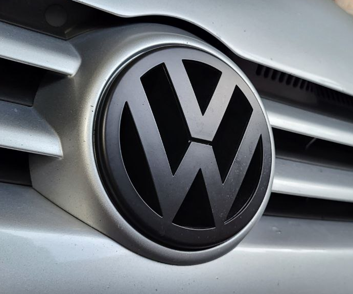
The two letters "VW" in a circle are known even to those who are not very interested in the automotive world. However, not everyone knows that the Volkswagen brand name comes from the German words Volks ("folk") and Wagen ("car"). And it is the abbreviation of them that forms the logo of the manufacturer of general purpose vehicles.
Toyota
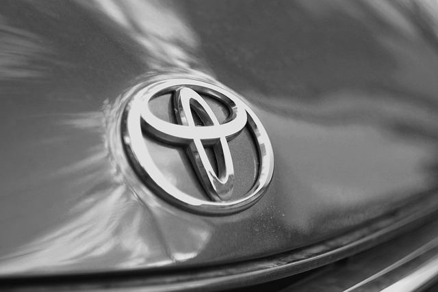
The Toyota logo dates back to the early 1990s. Before that, the company's cars were decorated exclusively with a badge with the brand name. The two ovals that intersect inside the third one symbolize the connection between customers and the company. They are based on friendly and strong relations, feelings of mutual trust. In addition, the ovals form a rounded letter "T". It is easy to guess that this is a reference to the name of the company and its founder - Toyota.
There is another meaning that touches the history of the brand and reminds of the company's primary activity - the textile industry. The eye of a needle through which a thread is threaded - and all this inside the globe.
Ford
The logo of the Ford company has undergone many changes over the years of the formation of the brand. However, despite this, a special handwriting was always visible in him. The modern logo consists of a blue oval with the signature of the company's founder, Henry Ford, inscribed in it. It symbolizes adherence to traditions, minimalism, elegance and reliability.
BMW
Many believe that the BMW logo is a stylization of a propeller against a blue sky and white clouds. The idea originated as early as 1929 after an advertisement that featured airplanes with BMW logos inscribed in spinning propellers. The purpose of this advertisement was to promote a new aircraft engine produced by BMW. The propeller perfectly fit into the advertising image of the young brand.
So, the history of the BMW logo is based on a legend that lives on to this day. In the end, the company did not try to deny it. She only emphasized that the BMW emblem symbolizes mobility, energetic impulse and the face of the future.
Peugeot
The founders of the Peugeot company, the Pierre brothers, started their business with the production of metal products. They made tools, springs, machine tools and even kitchen utensils. When there was a need for an emblem that would distinguish their products from competitors, the brothers thought of an image of a lion. After all, it metaphorically conveys the advantage of cutting tools of their production. The logo shows three main qualities: the strength of the products, like the fangs of a lion, the elasticity of the metal plates, like the flexibility of the back of a beast, and the speed of cutting, which can be compared to the speed of a predator when it pounces on its prey. When the company began to produce vehicles, it decided to leave an emblem that symbolizes the reliability and strength inherent in their cars.
Mazda
Mazda Motor Corporation, formerly known as a Japanese industrial production company, got its name in honor of the supreme Zoroastrian god Ahura Mazda, whose name was consonant with the surname of the company's founder, Matsuda. It is said that the first meaning of the logo was interpreted precisely as an image of a god holding the sun in his hands as a symbol of tomorrow. Today, it is interpreted as an image of a seagull (or an owl) flying in an oval, creating the letter "M" - the first letter of the Mazda brand name. This stylization indicates that the company is flying towards endless creativity in the future.
Renault

Renault is one of the oldest automobile companies in the world, founded by three brothers: Louis, Marcel and Fernand Renoir. The Renault logo consists of a pattern in the form of a diamond or a rhombus, symbolizing the fusion of three brothers. During its history, the company has changed its corporate style several times, but the rhombus shape has always appeared on every logo. So this geometric shape became the personification of the brand. According to the company's design director, the rhombus is one of the most famous shapes in the world. It is a simple geometric figure that depicts a strong and strong-willed character.
Hyundai
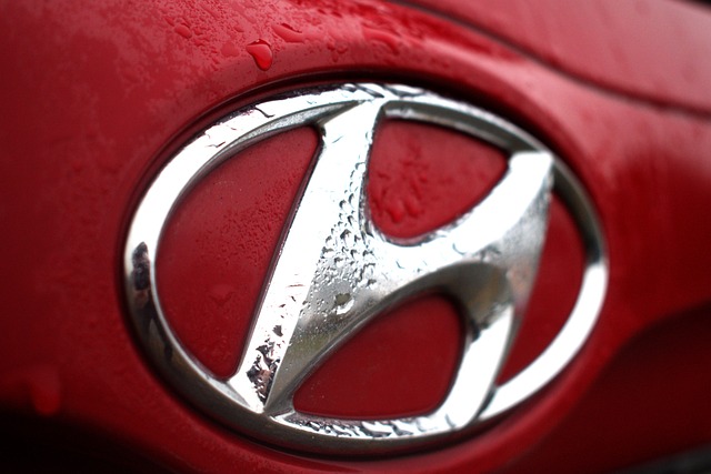
In 1947, Chung Joo-yoon created the Hyundai Motor Company, which over 50 years of development became the largest car manufacturer in Korea and became one of the world-renowned car companies. Its trademark is represented by an inclined letter "H" (the first letter of the name HYUNDAI). As the creators of the logo explain, the meaning hidden in it emphasizes the company's cooperation with its customers. According to the official version, the emblem shows a representative of the brand shaking hands with a potential buyer. Hyundai Motor Company is a symbol of development in harmony and stability.
Skoda
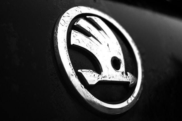
The logo with the famous "winged arrow" was first used in 1926. Its origin is still disputed. Some people see a stylized image of the head of an Indian in a traditional headdress with feathers. The history of its appearance is associated with Emil Škoda. According to legend, he was accompanied by an Indian during a business trip to America. And in memory of him, Skoda first hung a portrait of a red-skinned friend in his office, and then initiated the development of an "Indian" logo. Others see birds or an arrow in the image of the wing. which symbolize launched technological progress and forward movement.
To be continued…
And for now, take care of yourself.